BuildingBlocks: Drawer
Building on our previous work, we’re going to separate the notification demos, from the alarm demos using the Drawer. Download BuildingBlocks here.
First Attempt
According to the documentation, all we need to implement the drawer is to import
headers.css- the
style/headersfolder drawer.css- the
style/drawer.cssfolder
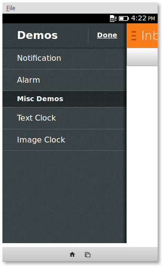
Then we can specify the navigation in the sidebar with the following HTML
<section data-type="sidebar">
  <header>
    <menu type="toolbar">
      <a href="#">Done</a>
    </menu>
    <h1>Demos</h1>
  </header>
  <nav>
    <ul>
      <li><a href="#">Notification</a></li>
      <li><a href="#">Alarm</a></li>
    </ul>
    <h2>Misc Demos</h2>
    <ul>
      <li><a href="#">Text Clock</a></li>
      <li><a href="#">Image Clock</a></li>
    </ul>
  </nav>
</section>
This is broken down into 2 parts:
header: the section which provides the header to the drawer navigation. This one just contains a toolbar with aDonebutton and ah1headernav: the section which contains the navigation links. It’s just two unordered lists separated by ah2header
We can specify the content of the webpage in the following format
<section id="drawer" role="region">
  <header>
	<a href="#content"><span class="icon icon-menu">hide sidebar</span></a>
	<a href="#drawer"><span class="icon icon-menu">show sidebar</span></a>
	<h1>Inbox</h1>
   </header>
   <div role="main">
	<button> Notify </button>
   </div>
</section>
Again, this includes a header which in this case contains two links: one to open the sidebar and one to hide the sidebar. The content of the page is inside <div role="main">.
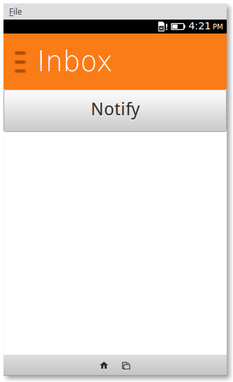
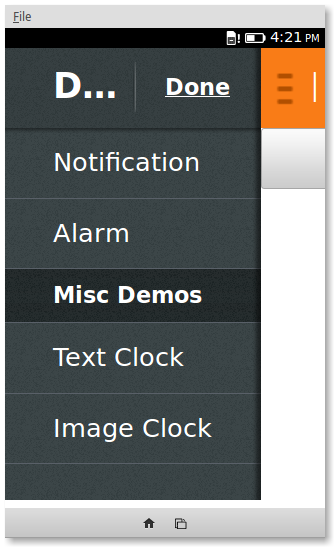
But having done that, we are met with something like this
Upon close inspection…
It seems like something went very wrong, but the following CSS will fix it
html, body {
    margin: 0;
    height: 100%;
    width: 100%;
}

section[role="region"] {
    background: #fff;
    height: 100%;
}
Here’s a quick overview of what was happening. drawer.css absolutely positions the sidebar on the webpage with a small z-index. The effect is that the side bar is all ways in the back of the layout. The section with the content was just large enough to wrap the header and button and it had a transparent background. The rules under section[role="region"] fix these problems. The next problem was that the containing elements of section, html and body, were not stretching to the available space. The fix for this was to set margin: 0; and height: 100%.
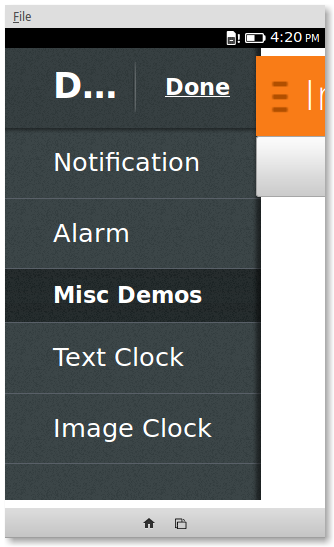
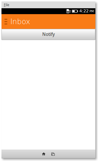
Close, but something isn’t quite right…
There are just some minor problems left to solve. The icon for the drawer is over-scaled and it makes the bitmap look fuzzy. The title of the sidebar is too big and cannot be read. To downscale the whole UI we can simply decrease the root font-size with html { font-size: 62.5%; } to get us the following result.
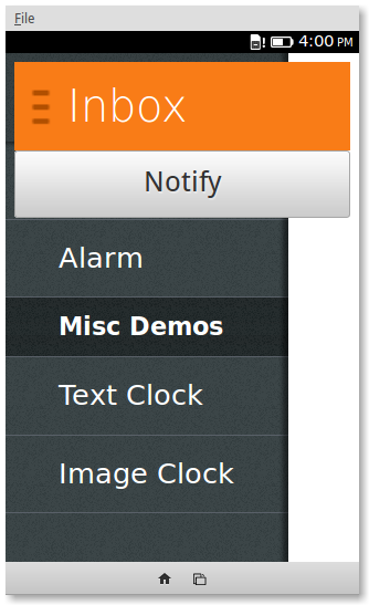
Yay! Now what?
Implementing the actual navigation will actually take a bit more work. Instead, we’re going to take the easy way out and hide/show buttons based on the navigation clicks.
This is the structure of the content
<div role="main">
 <h1 id="message"> Welcome to API Showcase.
  You can try out any API demo by opening up the drawer.</h1>
 <button id="btn-nofity"> Notify Me!</button>
 <button id="btn-nofity-wait"> Notify Me! (Wait 5s)</button>
</div>
And this is the structure of the navigation
<section data-type="sidebar">
	<header>
		<menu type="toolbar">
			<a id="nav-message" href="#">Done</a>
		</menu>
		<h1>Demos</h1>
	</header>
	<nav>
		<ul>
			<li><a id="nav-notify" href="#">Notification</a></li>
			<li><a id="nav-notify-wait" href="#">Alarm</a></li>
		</ul>
	</nav>
</section>
The CSS to hide the buttons
#btn-nofity {
    display: none;
}

#btn-nofity-wait {
    display: none;
}
And the javascript to bring it all together
document.querySelector('#nav-notify').addEventListener ('click', function () {
	notifyButton.style.display = "block";
	notifyLaterButton.style.display = "";
});

document.querySelector('#nav-notify-wait').addEventListener ('click', function () {
	notifyButton.style.display = "";
	notifyLaterButton.style.display = "block";
});

document.querySelector('#nav-message').addEventListener ('click', function () {
	notifyButton.style.display = "";
	notifyLaterButton.style.display = "";
});
Try the demo and check out the source code.
Recent Blog Posts
- 20 Jan 2026 » I love the old man minimap in VS Code
- 03 Jan 2026 » On Resurrecting a 12 year old blog
- 09 Oct 2014 » Updating a forked Git repo
- 06 Oct 2014 » ADB access to remote server from local usb
- 30 Mar 2014 » Bug Progress: Day 2
- 27 Mar 2014 » Building the Emulator
- 11 Mar 2014 » Simple Notes: Edit Notes
- 10 Mar 2014 » Simple Notes: Hidden Notes Fix
- 07 Mar 2014 » Bug Progress: Day 1
- 06 Mar 2014 » Simple Notes: Date