BuildingBlocks: Buttons
Before we keep exploring WebAPI, we can take a moment to build a UI foundation our API Showcase app. I previously mentioned Gaia Building Blocks. It’s a mini GUI framework for Firefox OS. So far, the application only showcases 2 APIs: Notification and Alarm. Let’s examine the Button building block
Downloading
You can download Building Blocks here. This is an archive of the sample application for the framework, but the framework is the collection of files under the style directory.
Baby Steps: Button
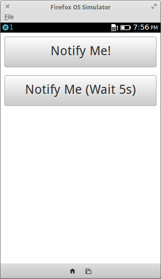
Now to implement the buttons. It’s actually pretty simple. Recall that our previous rendition of API Showcase contained the following buttons.
<body>
	<button id="notifyButton">Notify Me!</button>
	<button id="notifyLaterButton">Notify Me, but 5 seconds later!</button>
</body>
All that is needed to convert the buttons is to add buttons.css to the page and the style/buttons/ folder to our css directory.
<head>
	<link href="css/style/buttons.css" rel="stylesheet" type="text/css">
</head>
And that’s it! The buttons work the same way as before, they just look different
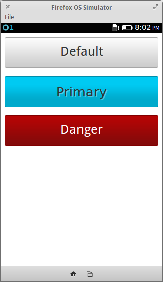
With a little bit of tweaking to the HTML, we can change the look and behavior of the buttons…
<button>Default</button>
<a class="recommend" role="button" href="#">Primary</a>
<button class="danger">Danger</button>
The “recommend” button is implemented with an a element of class recommend and the role="button" property. The “danger” button simple requires adding the danger class to a button element.
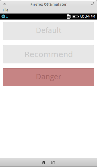
If we add disabled="disabled" to the button elements and aria-disabled=true to the a button elements, we disable the buttons.
<button disabled="disabled">Default</button>
<a class="recommend" role="button" aria-disabled="true" href="#">Recommend</a>
<button class="danger" disabled="disabled">Danger</button>
Lastly, creating a list of buttons also changes their look.
<li> <button>Default</button> </li>
<li> <button disabled="disabled">Disabled</button> </li>
<li> <button>Action 1</button> </li>
<li> <button class="icon icon-view">View Name</button> </li>
<li> <button class="icon icon-dialog">Change Date</button> </li>
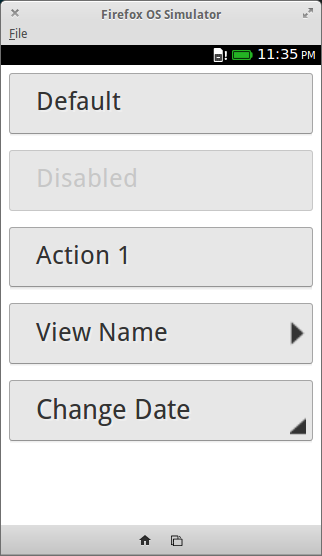
This is useful when grouping actions together or when you want to trigger a dialog. Using the classes icon icon-view will create a button that suggests to the user something will be shown. The classes icon icon-dialog will suggest that a dialog will be shown.
Recent Blog Posts
- 20 Jan 2026 » I love the old man minimap in VS Code
- 03 Jan 2026 » On Resurrecting a 12 year old blog
- 09 Oct 2014 » Updating a forked Git repo
- 06 Oct 2014 » ADB access to remote server from local usb
- 30 Mar 2014 » Bug Progress: Day 2
- 27 Mar 2014 » Building the Emulator
- 11 Mar 2014 » Simple Notes: Edit Notes
- 10 Mar 2014 » Simple Notes: Hidden Notes Fix
- 07 Mar 2014 » Bug Progress: Day 1
- 06 Mar 2014 » Simple Notes: Date